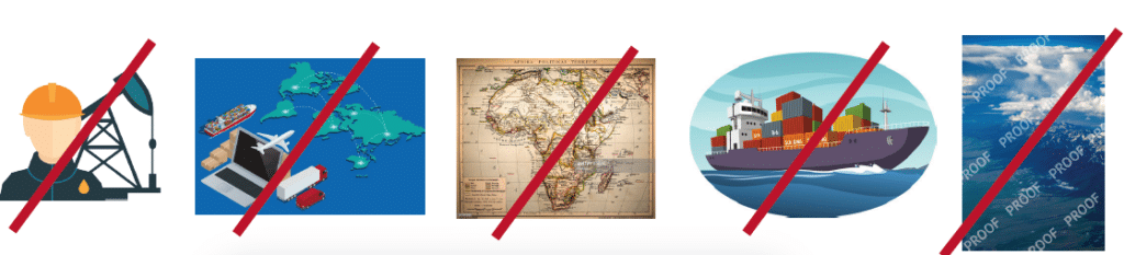
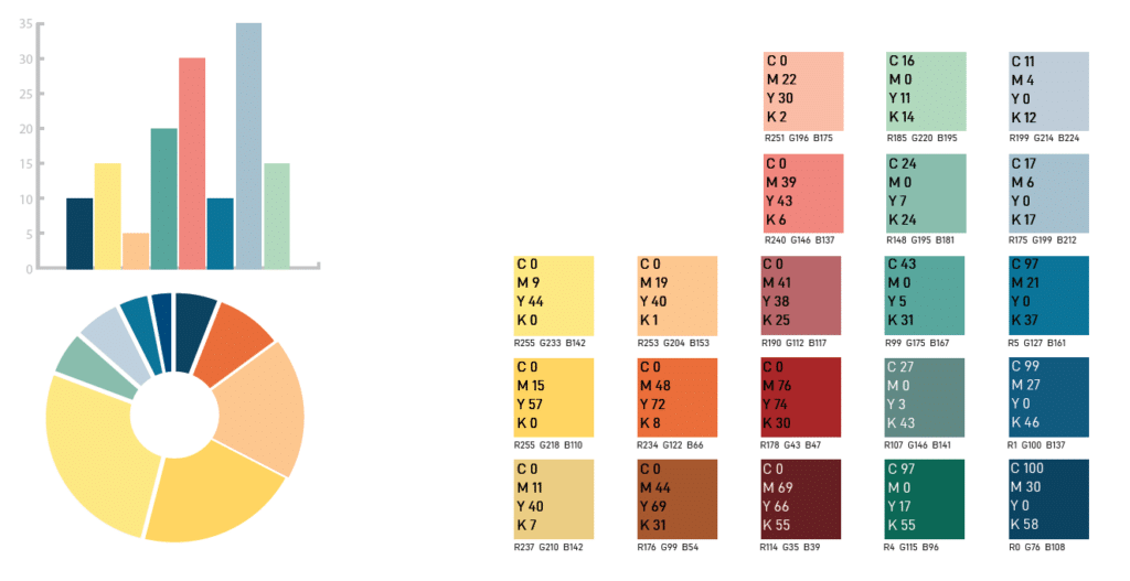
Charts and graphs convey complex data and information in an engaging way that is easy to understand. Our approach to graphs is clean, straightforward, and clear. The preferred style for graphs and icons is simple, flat, and two-dimensional. Use shades from the brand color palette. Greys should be used for competitors and less dominant statistics. Here are some examples of illustrations that should be avoided:
DO NOTuse busy or too colorful illustrations
DO NOT use cartoonish, stylized or clip art illustrations
DO NOT use illustrations “clipped” inside a shape
DO NOT use stereotypical illustrations
DO NOTuse vintage or retro styling
DO NOT use non-circular patterns
DO NOT use items with watermarks or copyrights
DO NOT use decorative embellishments, clipart, 3D, drop shadows and/or gradients.
DO NOT create icons or badges and use them as logos
Typography
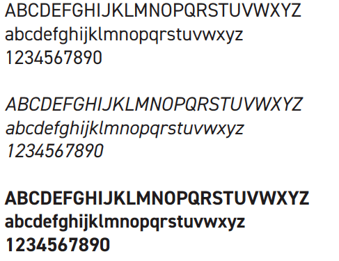
Western Midstream uses the D-Din family font system to give our business and marketing materials a consistent and distinctive personality. D-DIN is a versatile sans-serif family.
Fonts Used in Microsoft Office
D-DIN (a free font) or Roboto (a Google font) has been selected as the desktop fonts for Microsoft Office Applications. Open Sans may also be used when D-DIN is not an option.
Photography is a powerful and central element in our communications with all audiences.
Images play a key role in the feel of our brand, so content, color, mood, and composition are key.
DO use real, authentic photographic style that shows people in a natural, authentic way.
DO NOT use overly posed and unnatural photos of people.
DO NOT use photos with other company logos without approval.
DO NOT use photos or graphics with watermarks or copyright restrictions.
HSSE and Corporate Communications must approve all photos of Western Midstream facilities and employees for any external communication, publication, or presentation.
Email Signatures
Using consistent email signatures for emails is an opportunity to create brand alignment while relaying relevant contact information. In addition, consistent and clear email signatures present a professional appearance for conducting business through email.
The following are recommended guidelines for Western Midstream email accounts:
Company name: Do not refer to Western Midstream as “Western Midstream Partners” or “WES” in email signatures.
Avoid images, logos and vCards: Most email clients process these as attachments or block them by default. This includes all Western Midstream logos and should not be included in a signature.
Less is more: Email signatures should be under ten lines. If you feel you need to add more information, use pipes (|) to separate components adding two spaces between content and pipes.
Quotes: Refrain from using quotes or epigraphs in business communications to keep the message professional and to avoid having others assume a particular statement represents the institution.
Font: Use Open Sans 10.5-point or less, a standard font on Mac and PCs that works in all email clients. Non-standard fonts and HTML may not translate across email clients.
Font Color: Black is preferable.
Phone numbers: Include the phone and/or fax numbers you use regularly in an effort to make it easy for others to reach you. Do not include a cell or fax number if it’s not something you often use or want to share broadly.
Social media: Adding links to social media channels is optional; you can promote the main accounts on Facebook and LinkedIn. Social media icons should not be used.
URL conventions: No need to use the “www” in a URL unless the URL won’t work without it. For example, WesternMidstream.com.